Graphs
Bar Graph
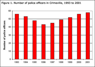
Bar graphs can represent all kinds of variables, including the frequencies of separate categories that have no set order, such as hair colour or citizenship. Your variables (x-axis) do not have to be continuous numbers, it could be anything that you want to know.
Histogram
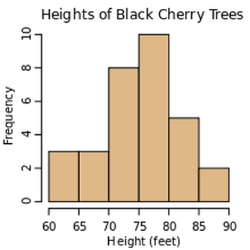
A HISTOGRAM is special form of bar graph. It shows the proportion of the frequencies of the values of the independent variable (x-axis). The HISTOGRAM is often used for variables whose values can be arranged in numerical order, especially continuous variables such as weight, temperature or travel time. A HISTOGRAM is not good idea to use for discontinuous variables or non-numerical data.
Circle graph (A.K.A Pie Charts) and Pictographs
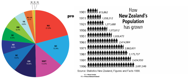
The Circle Graph or Pictograph is a favorite tool to represent categorical data, an alternative to measuring numerically. People like these two graph types because they are more fun to look at and are colourful.
Table of Values
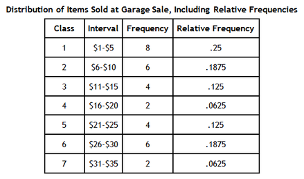
Frequency: How many times does each events happen for a specific intervals?
Relative Frequency: What is the percentage of an event for a specific interval proportional to the total number of events?
Example: Class 1 has 8 frequencies, the total number of frequencies on left table is 32
So, 8/32 = 0.25. See?
Relative Frequency: What is the percentage of an event for a specific interval proportional to the total number of events?
Example: Class 1 has 8 frequencies, the total number of frequencies on left table is 32
So, 8/32 = 0.25. See?
